Plotting
This page will help you get started with plotting in R using Jupyter notebook. I will be going through some tutorials to create useful plots for ancestry inference.
Getting Started with Jupyter Notebook
You should alredy have jupyterlab and an r-kernel installed, and you can enter a jupyter session using the following command:
//You want to enter a port number for <localhost port> (e.g. 8000)

jupyter lab --no-browser --port=<localhost port>
If you want more information, check out this link.
If this does not work, it is also possible to connect to a remote server using Visual Studio Code and edit the Jupyter notebook directly. More instructions on that here:
To reiterate, we will be programming using R in a Jupyter Notebook. All of the code shown will be R.
PCA Plots
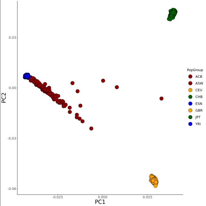
Once in Jupyter Notebook, here is a quick example on how to create a PCA plot in R. Here I will be using a subset of the 1000 Genomes Project reference dataset that only includes European, African, and East Asian samples. This dataset is merged with American admixed populations, meaning their genetic makeup is the result of a mixture of different reference populations.
First we have to load our libraries:
library("plyr")
library('dplyr')
library('ggplot2')
library('readr')
library('stats')
Next, we can load in our table(s). In this case, it is just one file with the eigenvector data obtained from my plink files:
eigenvec = read.table("../Data/Sample1KGP/sampleData1KGP.PCA.eigenvec", header = FALSE, sep = " ")
The next thing I did is reformatted the table to make plotting easier:
//Rowname changed from 1, 2, etc. to the specific sample identifier (ACB1, ACB2, ESN1, etc.)
    rownames(eigenvec) <- eigenvec[,2]


//Cutting out starting rows, leaving only eigenvector data
    eigenvec <- eigenvec[,3:ncol(eigenvec)]


//Formatting table to only include first two PCs, changing column headers
    colnames(eigenvec) <- paste('PC', c(1:20), sep = '')
    eigenvec$IndividualID = row.names(eigenvec)
    eigenvec = eigenvec[c("IndividualID", "PC1", "PC2")]
    row.names(eigenvec) <- NULL


//Adding a column named PopGroup, that includes the population group of each sample as a column
    eigenvec = transform(eigenvec, PopGroup = substr(IndividualID, start = 1, stop = 3))
Now we can move on to plotting. Using the package ggplot2, we can create a PCA plot from our eigenvector data:
//Color List

    colors  <- c("YRI" = "blue", "ACB" = "dark red", "ASW" = "dark red", "CEU" = "orange", "CHB" = "dark green", "ESN" = "blue", "GBR" = "orange", "JPT" = "dark green")


//Plotting PCA plot for the top two PCs.

    options(repr.plot.width=12, repr.plot.height=12)
    ggplot(eigenvec, aes(x=PC1, y=PC2, fill=PopGroup)) + scale_fill_manual(values=colors) +
        geom_point(size = 7, pch = 21, color="black") + theme_classic() + theme(axis.title=element_text(size=23)) + theme(axis.text.x=element_text(size=14)) + theme(axis.text.y=element_text(size=14)) +
        theme(legend.key.size = unit(1, 'cm'), #change legend key size
            legend.key.height = unit(1, 'cm'), #change legend key height
            legend.key.width = unit(1, 'cm'), #change legend key width
            legend.title = element_text(size=14), #change legend title font size
            legend.text = element_text(size=14)) #change legend text font size
Running this will create a plot similar to this, which is our working PCA plot.
Admixture Plots
The following will be an example on how to make an admixture plot, with the same example data used for the PCA plot example above.
Note: These plots were created using output files from Admixture. Rye is also acceptable, however the output file will need to be manipulated differently to generate a plot using the same R code here.
First we have to load our libraries:
library("plyr")
library("dplyr")
library("ggplot2")
library("reshape2")
Now we can take our plink .fam file and format it to show the population and individual IDs for each sample
#Converting this to get Population Group and Individual ID data

GroupData = read.table('../Data/Sample1KGP/sampleData1KGP.fam', colClasses = c(rep("character", 2), rep("NULL", 4)), header = FALSE)
colnames(GroupData) = c("PopGroup", "IndividualID")
GroupData <- subset(GroupData, select=c(2,1))
Now let's get their Ancestry estimates obtained from Admixture (.Q file)
admixtureAncestryEstimates = read.table("../Data/Sample1KGP/repTest/sampleData1KGP.3.Q", header = FALSE)
head(admixtureAncestryEstimates)
Now we can combine the ancestry estimates from the .Q file with Individual IDs and Population Groups from the .fam file
GroupData = cbind(GroupData, admixtureAncestryEstimates)
head(GroupData)
Ancestry Groups not assigned by Admixture, so we need to figure it out ourselves
options(scipen = 10000)
GroupData %>% group_by(PopGroup) %>% summarise_at(vars(V1, V2, V3), funs(mean))

########################
Output:

PopGroup V1            V2        V3
1 ACB      0.00128136458 0.1080905 0.8906281
2 ASW      0.02441562295 0.2064456 0.7691388
3 CEU      0.00001019192 0.9999798 0.0000100
4 CHB      0.99998000000 0.0000100 0.0000100
5 ESN      0.00001016162 0.0000100 0.9999798
6 GBR      0.00001021978 0.9999798 0.0000100
7 JPT      0.99998000000 0.0000100 0.0000100
8 YRI      0.00001008333 0.0000100 0.9999799

This allows us to determine what column corresponds to which ancestry group given our knowlege of our reference populations
Now we can rename the columns with the corresponding ancestry groups (In this example, V1 = East Asian, V2 = European, V3 = African)
GroupData = GroupData %>% dplyr::rename("European" = "V2",
                                    "African" = "V3",
                                    "EastAsian" = "V1",)
Now we need to bring ancestry into one column instead of three:
GroupDataSorted = arrange(GroupData, EastAsian, European, African, group_by = PopGroup)

row.names(GroupDataSorted) <- NULL
GroupDataSorted$index= as.numeric(rownames(GroupDataSorted))

GroupDataSorted = melt(data = GroupDataSorted, id.vars = c("IndividualID", "PopGroup", "EastAsian", "European", "African", "index"), measure.vars = c("EastAsian", "European", "African"))

colnames(GroupDataSorted)[7] <- 'Ancestry'
colnames(GroupDataSorted)[8] <- 'AncestryFraction'

print(GroupDataSorted[c('IndividualID', "PopGroup", "Ancestry", "AncestryFraction", "index")])
This next step is not necessary, but I did it for simplicity for the final plot. Here I am subsetting my entire table to extract only admixed samples, which are our samples of interest in this example:
GroupDataSorted2 = GroupDataSorted[grep("A", GroupDataSorted$IndividualID),]
#GroupDataSorted2$index= as.numeric(rownames(GroupDataSorted2))
Lastly, we can now create our admixture plot!
colors  <- c("African" = "blue", "European" = "orange", "EastAsian" = "red")

Admix_Plot = ggplot(data=GroupDataSorted2, aes(x=as.character(index), y=AncestryFraction, fill=Ancestry)) +
    geom_bar(stat="identity", width=1) + facet_grid(cols = vars(PopGroup), scales = "free", space = "free", drop = TRUE, switch="both") +
    scale_fill_manual(values=colors) +
    labs(y="Perxcentage Ancestry Estimate", title = "Admixture plot for four population groups from 1KGP", subtitle = "Groups: ACB, ASW\nRef Groups: CEU, CHB, ESN, GBR, JPT, YRI") +
    theme(axis.title.x=element_blank(), axis.text.x=element_blank(), axis.ticks.x=element_blank(), panel.spacing.x=unit(1, "lines"),
        strip.background = element_blank(), panel.background = element_blank(), axis.text=element_text(size=12),
        axis.title=element_text(size=18), strip.text.x = element_text(size = 18), title = element_text(size = 20))
Final Plot:
